There is a moment during a long night drive when the cabin finally goes quiet. Not silent — the engine is still humming, the tires are still working — but quiet in the way that matters: all the lights have settled, all the screens have dimmed, and the instruments are giving you exactly the information you need and nothing more. In that moment, the dashboard is not performing. It is simply doing its job, and the car feels complete.
This experience has become rarer than it should be. The modern dashboard, in its race toward digital spectacle, has forgotten one of the oldest principles of good design: a tool should never draw more attention than the task it enables. A chef’s knife does not light up with animated graphics when you use it correctly. A writer’s keyboard does not applaud each completed sentence. Yet the contemporary car interior has been transformed into a stage where the dashboard competes with the road for the driver’s attention, and in too many cases, the dashboard is winning.
The Dashboard That Won't Stop Talking
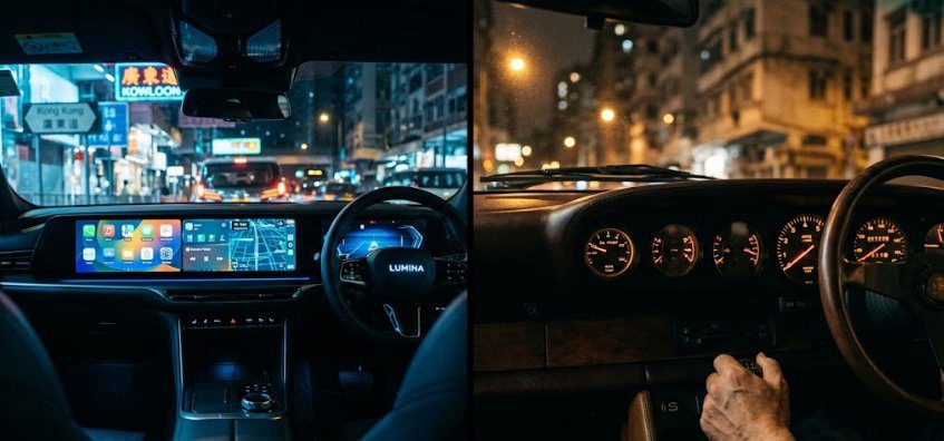
Walk through any recent auto show or scroll through a luxury car configurator and you will find dashboards that look less like vehicle interiors and more like home theater installations. Screens stretch from the driver’s door to the center stack. Ambient lighting pulses in a dozen selectable colors. The instrument cluster is no longer a cluster but a screen, its graphics rendered in high-resolution gradients that change with every driving mode. The car is no longer a car. It is a content delivery system that happens to have wheels.
This is not progress driven by driver need. It is progress driven by showroom competition. When a prospective buyer sits in a car for two minutes on a dealership floor, the thing that impresses immediately is the screen. It is bright, it moves, it looks expensive. The car that seems more “advanced” is the one that most closely resembles a smartphone. But the test of a dashboard is not two minutes of showroom admiration. It is two hours of night driving, when the novelty has worn off and all that remains is the interface between the driver and the machine.
A good dashboard, like good lighting in a restaurant, is something you should not notice unless you consciously decide to. It should illuminate the necessary information — speed, engine revolutions, fuel, navigation when requested — and then retreat. It should ask nothing of you. It should not demand to be touched, swiped, or admired. It should not interrupt the act of driving with notifications, animations, or marketing messages. Its job is to support, not to star.
Question: What is the fundamental difference between a dashboard designed for use and one designed for applause?
Designed for Use | Designed for Applause |
|---|---|
Information hierarchy is clear: speed and engine state first | Information is flat: everything competes for equal attention |
Analog or restrained digital gauges with high contrast and instant legibility | Animated displays with startup sequences, gradients, and motion graphics |
Physical controls for primary functions (volume, climate, drive mode) | All controls buried in touchscreen menus with haptic feedback |
Materials chosen for tactile quality and low glare | Materials chosen for showroom shine and screen reflectivity |
Dashboard architecture fades into peripheral awareness | Dashboard architecture dominates the visual field, even at night |
Car feels calm, coherent, and driver-focused | Car feels restless, entertaining, and easily dated |
The Architecture of Restraint
The best dashboards I have encountered share a common ancestor, whether they know it or not: the aircraft cockpit philosophy of essentialism. A pilot in instrument conditions needs to process a large amount of data quickly, with zero ambiguity. The instruments are grouped logically, lit evenly in a color that preserves night vision, and designed to communicate their state at a glance without demanding interpretation. This philosophy migrated into automotive design through companies that understood driving as a form of high-speed concentration rather than a passive entertainment experience.
Porsche, for decades, has been the most reliable guardian of this tradition. The 911 dashboard, even in its modern iterations, places the tachometer directly in front of the driver, centered and dominant. The speedometer and secondary gauges flank it. The ignition key is on the left. The climate controls remain physical. The screen, when present, sits low in the center stack, not rising above the dash line like a billboard. Everything about this layout tells the driver: the act of driving is the priority. The car is not here to distract you from the road. It is here to help you connect with it.

There is a similar discipline in older BMW cabins from the E39 and E46 era. The instruments were orange-lit analog dials with simple graphics. The center stack was angled slightly toward the driver. The controls were buttons and knobs, each one distinct by feel so that the driver could adjust the climate or the radio without looking away from the road. These cars were not anti-technology. They were anti-distraction. They understood that a dashboard’s primary job is to disappear, and they executed that job with the same rigor they applied to the suspension tuning.
The Problem of the Digital Stage
What changed was not just the arrival of screens. It was the arrival of screens governed by consumer electronics logic rather than automotive logic. A smartphone interface is designed to hold your attention for as long as possible. An automotive interface should do the opposite — it should give you what you need and then release you. But when the same designers who build phone operating systems are brought in to design car interiors, the result is predictable: dashboards that demand to be looked at, scrolled through, and updated, while the actual driving becomes a secondary activity taking place somewhere beyond the glass.
The most egregious examples are easy to find. Some recent electric vehicles have eliminated the instrument cluster entirely, placing all driving information on a central tablet screen. This forces the driver to glance away from the road to check their speed, turning a half-second instrument scan into a multi-second navigation of a flat menu structure. Other manufacturers have replaced the entire physical control set with touch-sensitive surfaces that provide no tactile confirmation. The driver presses a haptic panel and hopes the climate temperature changed. The car gives them a slight vibration in return — a digital substitute for the click of a button that required no thinking at all.
There is also the aesthetic problem. A screen-dominated dashboard ages poorly. The graphics that looked cutting-edge in the showroom will look dated in five years, and the car has no mechanism for graceful obsolescence. An analog gauge from a 1960s Alfa Romeo still looks beautiful today. Its typeface, its needle sweep, its warm backlighting are not tied to a specific software version. They are simply good design, which is timeless. A screen interface from a 2018 luxury sedan, by contrast, already looks like a relic of an earlier digital era, its skeuomorphic textures and laggy animations marking it as unmistakably of its moment.

What Gets Lost When the Screen Wins
The deeper loss when a dashboard prioritizes spectacle over function is not just ergonomic. It is emotional. A car that treats its driver like a user rather than a participant creates a fundamentally different relationship. The driver becomes a consumer of features, a tapper of icons, a recipient of software updates. The sense of partnership between human and machine — the feeling that the car is an extension of your own perception — dissipates into a glow of blue light and notification badges.
I have driven cars where the dashboard felt like a collaborator. The tachometer needle rose with the engine note, and the shift lights illuminated at the precise moment of redline, a visual cue so perfectly timed that it felt instinctive. I have driven other cars where the dashboard felt like a needy co-pilot, constantly suggesting music playlists, highlighting nearby coffee shops, and dimming the map at the wrong moment because a light sensor misread the ambient conditions. The first kind of car makes you a better driver. The second kind makes you wish you had brought a passenger to manage the interface so you could focus on the road.
The Return to Restraint
There are signs, faint but real, that the industry is beginning to recognize the limits of the screen-everything approach. Mazda has publicly committed to reducing screen size and prominence in its interiors, returning to physical controls and driver-focused layouts. Genesis is blending screens into horizontal dashboard architecture rather than bolting them on as standalone tablets. Even some electric vehicle startups, after initial experiments with fully touchscreen cabins, are reintroducing physical switches for critical functions.
This is not a Luddite argument against digital technology. A well-executed digital instrument cluster, with a clean, high-contrast layout and minimal motion, can be superior to an analog unit. A central screen for navigation, when it stays out of the way and responds instantly, is a genuine improvement over the map-in-the-glovebox era. The issue is not digital versus analog. It is distraction versus focus. It is the difference between a dashboard that serves the driver and a dashboard that performs for the showroom.
The best dashboards, like the best cars, are remembered in silhouette first — but the interior silhouette matters as much as the exterior one. The arc of the instrument binnacle, the angle of the center stack, the glow of the dials at night: these are the forms that the driver lives with. They should be composed with the same restraint, the same attention to proportion, and the same respect for the user’s attention that we demand from the bodywork outside.
I have written before about the roofline’s authority over a car’s emotional register, and about the quiet luxury of restraint in exterior design. The dashboard is the interior extension of that same argument. A great car does not need to tell you it is great. It just needs to place the right information in the right light and let you drive. Everything else is noise.